
A pivot table is an excellent way to summarize large data sets by organizing, filtering, and grouping data for easier insights. Unfortunately, they’re also one of the most intimidating tools in Excel!! Let’s learn how to conquer pivot tables 💪
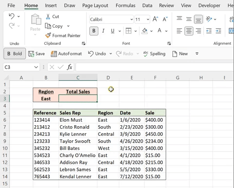
In the gif above, we’ve got a full set of sales data. Let’s say we want to summarize our monthly sales by region - a pivot table is the perfect tool for the job. To create the table, we’ll first select our data by pressing CTRL A, then we’ll insert the pivot table by navigating to the Insert tab and selecting the Pivot Table command. We’ll double check that the correct range is selected, and then we’ll define where we want our pivot table to appear. Let’s keep the default choice “New Worksheet” selected to insert the table into a new sheet, and hit OK.
Now that we’ve inserted our Pivot Table, we’ll need to build the table by dragging and dropping each field into the correct area in the PivotTable Fields window:
- “Row” area populates the rows of our pivot table
- “Column” area populates the columns of our pivot table
- “Filters” area adds the field as a filter toggle
- “Values” area is the data being summarized in our pivot table
If we want to summarize our sales by region by month, first we’ll set up the table by populating our rows and columns with the Month and Region fields, respectively. Then we’ll drop the Sales field into the values area, since that’s the data we’re summarizing, and our pivot table is complete!!
That wasn’t too bad, right?!