You're an Excel Wizard, 'arry

“Adulting” means getting excited to learn a new Excel trick. If you wanna impress your peers with some Excel wizardry, add sparklines to your data. (For the uninitiated, a sparkline is a simple visualization tool that will make you look like you’re the Dumbledore of dataviz.)

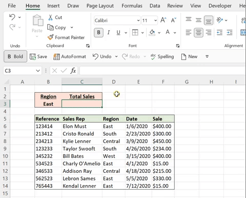
Sparklines use mini line, column, or win/loss charts within a cell to visually represent trends in data. In the example above, I added a line chart to the data to visually represent the trend of each employee’s sales by month. So to add a line sparkline to your own data, navigate to the Insert tab and select Line under Sparklines. Once the Sparkline dialog box opens, insert the data range of the cells you want to visually represent and hit OK. Now, simply drag the sparkline down the column to insert one for each row.

Related Video

Back to blog

Meet Emma

Emma is the founder of Excel Dictionary, your ultimate source for impactful, digestible Excel tips and tricks.  After graduating from The Ohio State University in 2019 with a degree in Actuarial Science, Emma began her professional career as an actuary, just in time for COVID to hit.  New to the industry, new to the company, adjusting to a new WFH environment, and new to Excel, Emma quickly realized how overwhelming those Excel projects could be and didn’t know where to turn for help – so she taught herself.

Emma created Excel Dictionary to help others avoid Excel overwhelm and to be the coworker that you can turn to.  She was recently awarded the Microsoft MVP award and has built a community of over 5 million people across the globe! Join her across all social channels to learn quick, actionable skills that will make you more efficient, comfortable, and confident in your daily work!

Follow Emma